Powered by Blogger.
Showing posts with label color palettes. Show all posts

COLOR FOR THANKSGIVING...

    In the last week I've been on a cooking kick - butternut squash ravioli, lemon artichoke pesto penne, winter kale soup, and much much more. Seems that fall has brought out the chef in me (and some comfort food cravings). And along with that? Some fall color palette cravings to set the table with...
    fall color palette
    Starting with this. After all, Thanksgiving is next week, and I'm tabletop scheming! Whatcha think?

    *images via tumblr (unknown source) and by mikael beckman

Post Title

COLOR FOR THANKSGIVING...


Post URL

http://cocokelleys.blogspot.com/2011/11/color-for-thanksgiving.html


Visit coco kelleys for Daily Updated Wedding Dresses Collection

PERFECT PALETTES:

    Some palettes never die for me and this is one of them. I adore the combination of this rich green (with a hint of teal) and bronze together...
    105982781_1tFX9o6q_c
    palette green gold black
    105784178_ddXRzYLz_c
    A kick of golden mustard or peach gives it a nice punch, and black adds a bit of drama. It's similar to this palette I put together last January - just a new evolution! Whenever I see color combinations reemerge in my life, I take note. I'm pretty sure it means they're ones I can live with for quite some time. What color combos are a constant in your life?


    *images on pinterest via wearing the pants and flickr

Post Title

PERFECT PALETTES:


Post URL

http://cocokelleys.blogspot.com/2011/08/perfect-palettes.html


Visit coco kelleys for Daily Updated Wedding Dresses Collection

THE PAINTED PALETTE

    One of my focuses for my new apartment is art. I feel like I've reached the point in my life where my taste level and aesthetic is clear enough that I can start investing in some pieces that I'll carry with me for years to come. So, I was over the moon ecstatic when contacted by painter Rachel Wright asking if I'd like to select some art from her site for my new place! This is the one I fell in love with...
    painted palette
    There's an amazing story behind it, too. Rachel painted this back in April when there was that crazy outbreak of tornadoes passing through Alabama.

    As she wrote to me, "It's a lot busier than most of my paintings because I was nervous all night. The weather was so scary. To calm myself down and to try not to think of a tornado hitting my home I started painting. I had almost finished it when the tornado siren went off, power went out and I quickly had to put my painting in a safe location and get in the hallway. When the night was over and we hadn't been hit I came back the next day to the painting and noticed that it had sort of changed form from the night before because of the way I propped it. I went with it and decided not to paint over some of the really elaborate drips and movements that it had formed. I normally never let a painting take its own shape and always hand-work it until I'm happy with it. But with this one I couldn't do anything about, and it ended up very beautiful - as if it were telling me to not worry, life happens, and everything is going to be ok."

    I know that every time I look at this painting it will remind me of this story - significant in so many aspects. As a reassurance that beauty finds its way to us in many different ways. That we don't always get to shape things into our own idea of perfection, but sometimes they end up the way they should be. And that we can weather any 'storms' that life brings our way.

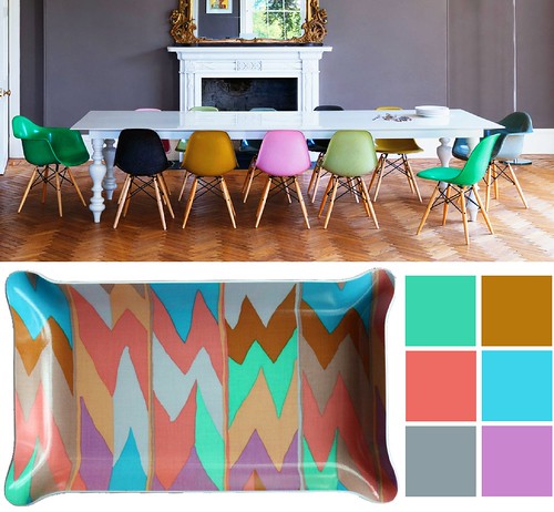
    Of course, I'm also inspired by the palette of this painting, and can't wait to find a perfect spot for it. I had already planned on having some aquas and greens in the living area, but that addition of a soft peachy pink is perfect for a feminine touch...
    palette inspirations2
    While I don't want things to get too girly, I do think a dose of these bright feminine colors balanced by black and white, and maybe even a bit of red, will play perfectly into my plans! I absolutely can't wait to receive my painting and see how it looks in my new home. Thank you so much Rachel - for the painting and the story that goes with it. I'll value it always!

    *house images via here, here, here and here

Post Title

THE PAINTED PALETTE


Post URL

http://cocokelleys.blogspot.com/2011/08/painted-palette.html


Visit coco kelleys for Daily Updated Wedding Dresses Collection

RED, WHITE + GREEN?

    While I work on putting together a few more posts from my travels in Italy, this color combination seems quite appropriate to share with you this morning...
    red green white
    A preppy twist to red, white and blue, the switch to green is unexpected for summer, don't you think? I love the little addition of pale blue or aqua to keep it feeling fresh, too.

    As a side note, Nick Olsen really hit this little studio apartment out of the park with his fun design - I immediately tore out the white sofa with green piping for my inspiration board. If you haven't seen it (all over blogland), check out the whole thing on House Beautiful's site.

    *pillow by unison, beach umbrella bag by roberta freymann

Post Title

RED, WHITE + GREEN?


Post URL

http://cocokelleys.blogspot.com/2011/07/red-white-green.html


Visit coco kelleys for Daily Updated Wedding Dresses Collection

PACKING A PALETTE

    Whenever I go on trips, I like to pack clothes in a similar palette so that I know I can mix and match pieces as I go. I'm just beginning to think about what to bring to Italy with me - but two weeks is a much longer time than a long weekend to consider just one color scheme! Which is why I may be taking some serious inspiration from this editorial as I select my wardrobe...
    italy palette packing inspiration
    I love the mix of rich jewel tones with softer pastels and nudes - there's tons of color, and endless options of ways to mix them all. The hardest part may be what hue to choose for my mani pedi! 

    *editorial photographed by lachlan bailey for vogue nippon

Post Title

PACKING A PALETTE


Post URL

http://cocokelleys.blogspot.com/2011/05/packing-palette.html


Visit coco kelleys for Daily Updated Wedding Dresses Collection

A SOFTER SIDE OF SPRING

    This year, we've seen brights everywhere for spring. They're fun and cheerful, and I adore them, but there's still something to be said for soft neutrals...
    spring palette pink+grey+black+peach
    Especially with the way they look against tanned skin! I especially love the touch of dramatic black (or deep charcoal grey) against this soft feminine palette that has always been a favorite of mine. So, so gorgeous. Funnily enough, I've always loved this combination of colors for a wedding palette, but i'm loving it for fashion, interiors and an everyday tabletop setting too. Stunning and romantic.

    *images: interior via simply grove, street style via unknown and tabletop by jane packer

Post Title

A SOFTER SIDE OF SPRING


Post URL

http://cocokelleys.blogspot.com/2011/05/softer-side-of-spring.html


Visit coco kelleys for Daily Updated Wedding Dresses Collection

HIP + HOP

    Pastels for Easter? So predictable. I think this year the Easter bunny needs to put a little more hip in his hop and add some super rad brights to bronze, grey and even a dash of black...
    totally rad easter paletteviadecorista
    And if I could get away with this holiday ensemble you bet I would. Do I see some tabletop inspiration coming from this palette?? I think so... stay tuned - this week is gonna be good.


    *dining room via the nytimes, tray available at furbish, striped ensemble via the decorista

Post Title

HIP + HOP


Post URL

http://cocokelleys.blogspot.com/2011/04/hip-hop.html


Visit coco kelleys for Daily Updated Wedding Dresses Collection

MY SPRING PALETTE: APRICOT + BLUE

    It's official - I'm making this my spring color palette inspiration:
    spring fashion color palette blue apricot coco+kelley
    I've already purchased a pair of apricot shorts and a very peachy little belt from Anthropologie, and I adore the way it looks with a pop of blue (any shade will do!). Which is funny because this was what my inspiration board looked like for last spring...
    2010 - 225
    Basically the same line of thought, but a little richer, with indigos and clay reds. I guess I should really start following my own advice a little sooner when making wardrobe purchases! I like freshening it up with black and white accents though - much more current!


    *image ali stephens for elle france (source unknown) and inspiration board by coco+kelley

Post Title

MY SPRING PALETTE: APRICOT + BLUE


Post URL

http://cocokelleys.blogspot.com/2011/02/my-spring-palette-apricot-blue.html


Visit coco kelleys for Daily Updated Wedding Dresses Collection

Followers

Popular Posts

My Blog List

Blog Archive